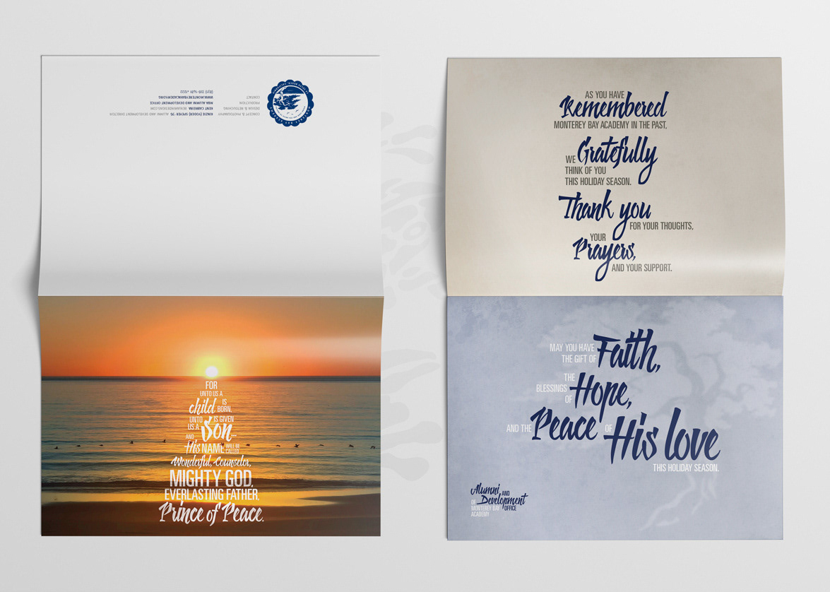

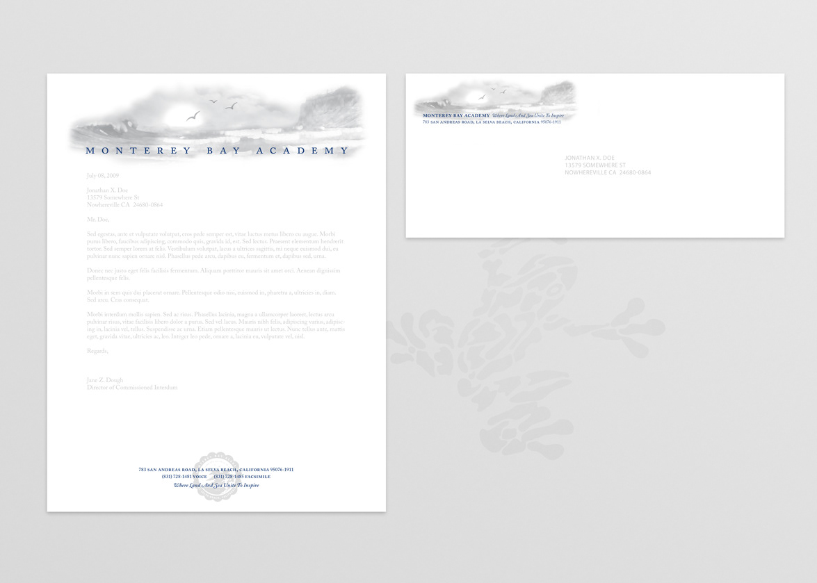
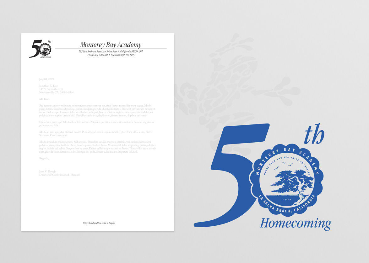
2009 Letterhead and Envelope — At the direction of the directors of the Alumni and Development and Marketing and Recruitment offices, new stationary was created to better convey the picturesque location of the school—highlighting both the shoreline and bluffs that run along the stretch of coastline surrounding the school. The design was revealed as part of the school's 60th anniversary celebration. A major motivation behind the design change was reducing the printing costs for printing on oversized paper to accomplish the bleeds on the previous design (see 2000 Letterhead below). While this design is two-color, the school's consultation with the commercial printer provided estimates that showed the school could still reduce printing costs compared to the previous design. It is believed that the school is still using this design.
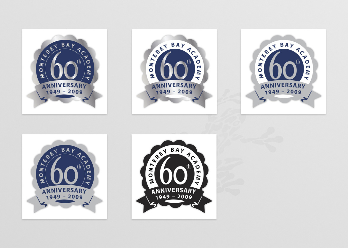
60th Anniversary Graphic — Instead of repeating another anniversary design for the stationary (below), the school opted to create a new design for the stationary, but also design a separate graphic that could be added to any media forms available at the time (e.g., website, email marketing, alumni magazine, etc.). After mulling through several design ideas, a consensus was reached to stick closely to something traditional, given the school's lengthy history and supportive alumni. Therefore, the iconic scallop design from the school's original logo was retained, along with the school's colors of blue, gray/silver, and white. The full-silver (top-left) and black and white (bottom-middle) were the primary designs used for most publications, but the other designs were adapted for various needs.
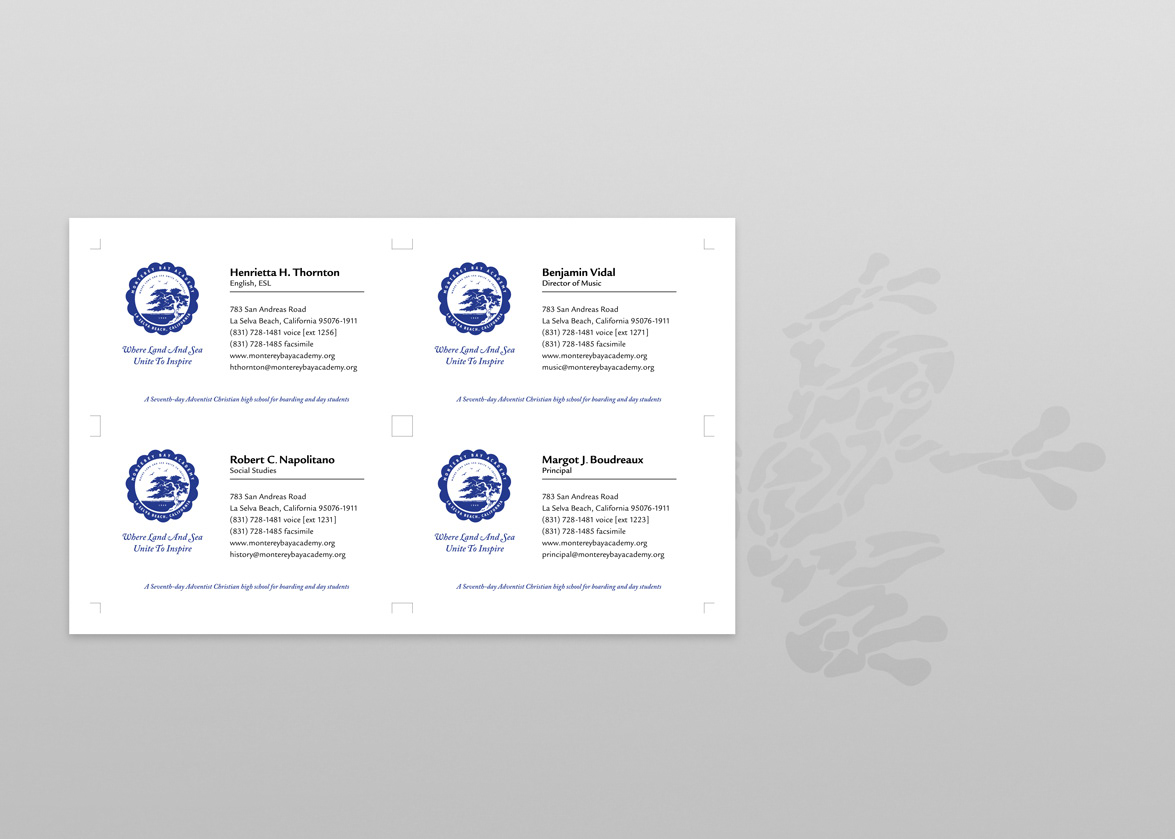
2006 Business Cards — At the direction of the school's principal, Benjamin Designs, along with the directors of the Alumni and Development and Marketing and Recruitment offices, was tasked with the job of creating a universal design for all of the school's staff. Until this point, most staff members did not have business cards. The few staff who did have cards were left to their own devices to create and print cards—utilizing multiple school seal variations (and quality), as well as color, font/type, and information variations, and oen printed on self-printed perforated paper. Note: Names and information listed above is for representation purposes only, and does not represent actual individuals.
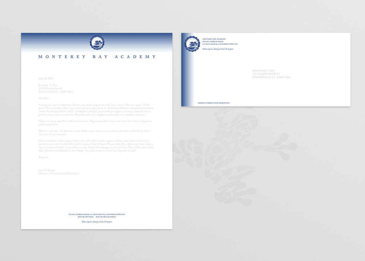
2000 Letterhead — Following the 50th anniversary of the school's existence, the principal and the directors of the Alumni and Development and Marketing and Recruitment offices decided that it would unwise to return to the outdated letterhead design previously used (see below). While deciding on a variety of concepts, another staff member offered the concept for this design, stating that the gradated blue bleed could reference the school's location along the shoreline—either inferring to the ocean shoreline, or to a horizon line and setting sun. After Benjamin Designs solidified the concept with a few minor changes (gradation amount and heading font thickness and spacing), the concept was unanimously approved. It was during this design that the school adopted an official Pantone Matching System (PMS) color—moving away from the CMYK Blue used to mix colors for press printing. At the encouragement of Benjamin Designs, a darker and slightly richer blue was selected.
50th Anniversary Letterhead (1999) — Originally conceptualized by the school's long-established graphic arts and technology teacher, Benjamin Designs redrew the teacher's original artwork to provide both the graphic (modified for the school's alumni reunion) and letterhead above. It was at this time that Benjmain Designs scanned and redrew the school's seal into a vector-based file (previously only available as film-based negative for commercial printing, or a camera ready art positive that was resized and repurposed via a copy machine.
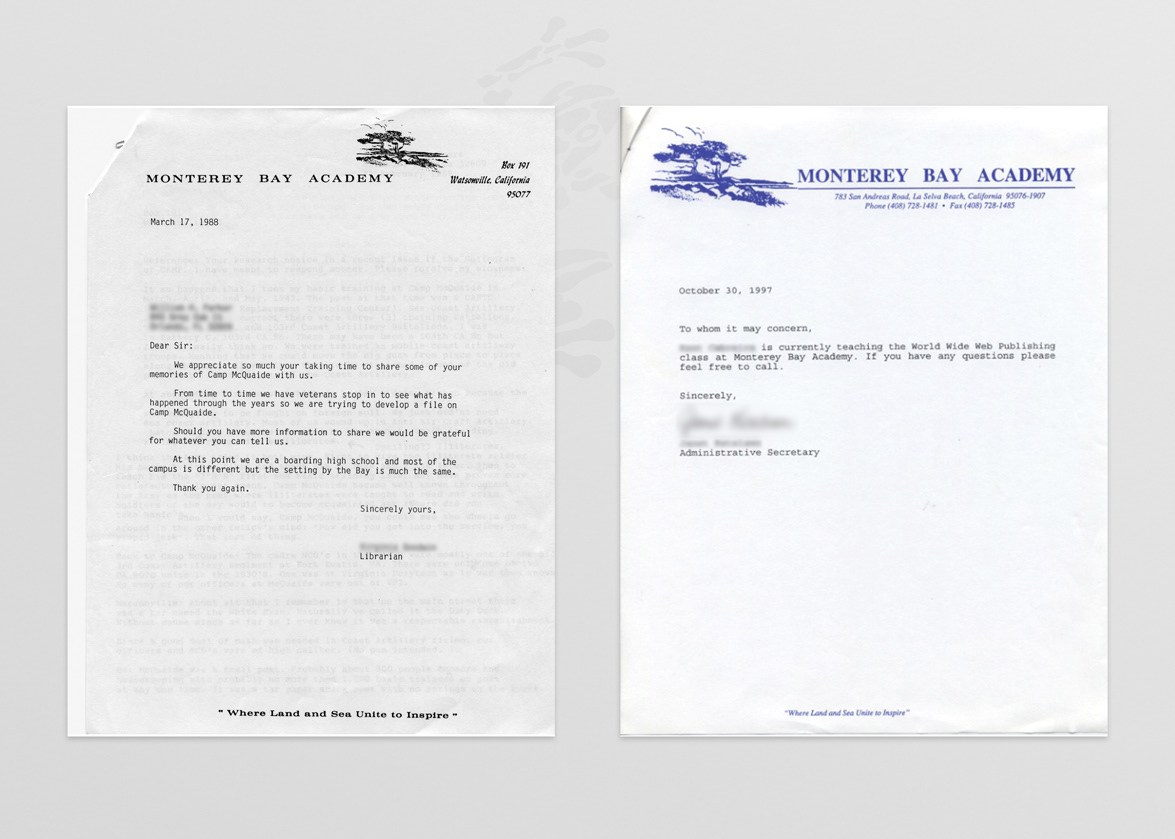
Previous Letterhead Designs (1988 and 1997) — For comparison purposes to the work by Benjamin Designs (above). Observers will note the use of both a Post Office Box and City of Watsonville in the school's address on the 1988 letterhead. Even though La Selva Beach was officially named in 1935, the school was required to use a post office box in Watsonville, as postal mail did not reach the school at the time. During this time, the school seal was changed to reflect the Watsonville address—much to the dismay of the school's alumni. During the creation of the 2000 Letterhead (above), Benjamin Designs learned that the school had it own separate ZIP+4 designation—different from that of the 1997 and 1999 letterheads.